

The Psychology Behind Attractive Wine Labels
In the competitive wine industry, first impressions often determine purchasing decisions. Before tasting the product, consumers rely heavily on visual cues, and wine labels serve as the primary point of interaction. An attractive label does more than identify a bottle—it communicates quality, personality, and brand story. Understanding the psychology behind label design can help brands influence consumer perception and drive sales.
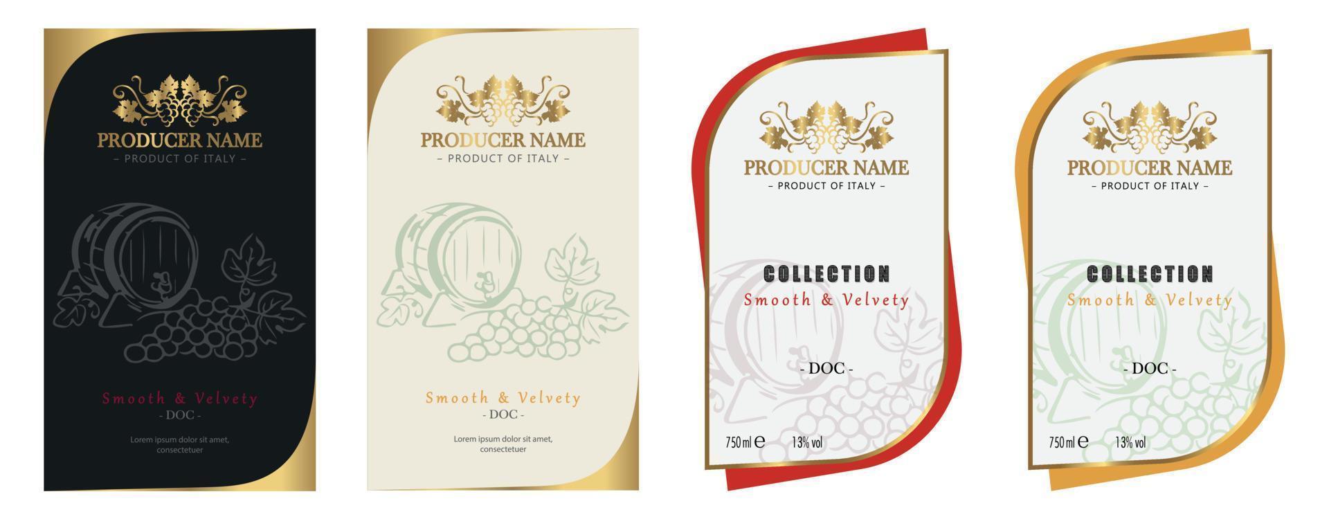
Wine labels are a blend of art and strategy. They are carefully designed to evoke emotions, build trust, and create a memorable identity that stands out on crowded shelves.
The Power of First Impressions
Consumers typically make quick decisions when browsing wine selections. Within seconds, a label must capture attention and convey value.
Using adhesive wine labels allows brands to create visually appealing and precisely applied designs that enhance the bottle’s overall presentation. These labels ensure consistency and durability while supporting intricate design elements.
Key factors influencing first impressions include:
-
Color combinations that evoke emotion
-
Clean and readable typography
-
Balanced layout and spacing
-
High-quality printing and finishes
These elements work together to create an immediate visual connection with the customer.
Color Psychology in Wine Label Design
Color plays a crucial role in shaping consumer perception. Different colors evoke different emotions and expectations, influencing how a product is perceived.
Common associations include:
-
Black and gold – luxury, sophistication, premium quality
-
Red and burgundy – richness, bold flavor, tradition
-
Green – freshness, organic, sustainability
-
White or pastel tones – lightness, elegance, simplicity
Brands that incorporate eco friendly wine labels often use earthy tones to emphasize sustainability and natural production methods, appealing to environmentally conscious consumers.
Typography and Visual Hierarchy
Typography is not just about readability—it also communicates personality. The choice of fonts and their arrangement can influence how consumers interpret the brand.
Effective typography strategies include:
-
Serif fonts for a classic and traditional feel
-
Sans-serif fonts for modern and minimalistic appeal
-
Script fonts for elegance and creativity
A clear visual hierarchy ensures that important information, such as the brand name and wine type, is easily noticeable. This clarity enhances the overall user experience.
Emotional Connection Through Design
Successful wine labels create an emotional connection with consumers. Whether it’s nostalgia, curiosity, or excitement, emotions play a key role in decision-making.
Wine branding labels often use storytelling elements such as:
-
Illustrations or artwork that reflect heritage
-
Unique symbols or icons
-
Descriptive taglines that evoke imagery
These elements make the product more relatable and memorable, increasing the likelihood of purchase.
The Role of Material and Texture
The physical feel of a label can significantly impact perception. Consumers often associate texture and material quality with product value.
Durable wine labels provide:
-
A premium tactile experience
-
Resistance to wear and tear
-
Long-lasting visual appeal
Similarly, waterproof wine labels ensure that the label remains intact even when exposed to moisture, maintaining its appearance in various storage conditions.
Simplicity vs. Complexity in Design
Striking the right balance between simplicity and detail is essential. While minimalistic designs convey elegance and clarity, more detailed designs can communicate richness and tradition.
Successful labels often:
-
Avoid clutter while maintaining visual interest
-
Focus on key design elements
-
Use contrast effectively to highlight important details
This balance helps brands appeal to a wide range of consumer preferences.
Building Trust Through Informative Labels
In addition to aesthetics, information plays a crucial role in building trust. Consumers look for details such as origin, ingredients, and production methods.
Well-designed labels:
-
Provide clear and accurate information
-
Highlight certifications or awards
-
Communicate authenticity and transparency
These factors contribute to a sense of reliability and credibility.
The Influence of Packaging Integration
Wine labels do not exist in isolation—they are part of the overall packaging experience. Consistency between the label and packaging enhances brand identity.
By integrating label design with custom product packaging, brands can create a cohesive and impactful presentation. A well-aligned approach to custom product packaging strengthens brand recognition and improves shelf appeal.
Conclusion
The psychology behind attractive wine labels lies in their ability to combine visual appeal, emotional connection, and functional design. From color and typography to material and storytelling, every element contributes to shaping consumer perception.
By using adhesive wine labels, incorporating eco friendly wine labels, and ensuring quality through durable wine labels and waterproof wine labels, brands can create labels that stand out and resonate with customers. Additionally, effective wine branding labels play a key role in building identity and trust.
In a market where choices are abundant, a thoughtfully designed wine label can make all the difference in capturing attention and driving purchasing decisions.